Kitebird
Headphones with a sense of humour
- Kitebird
- Consumer audio
- 2024
- London
- Brand identity, Packaging, Digital
Brand, packaging and a launch site for a headphone company that thinks listening should be fun, starting with a range in colours nobody else would ship.

The brief
Two audio engineers had built a great-sounding pair of headphones at a fair price. In a category of black, silver and serious, they needed a brand that would get noticed in a feed before anyone heard a note.
The idea
Take sound seriously and nothing else. Every image pairs the product with one absurd, perfectly lit prop on a candy-coloured backdrop, and every line of copy is a joke with a real spec in it.
What we made
The name and a chunky rounded wordmark, a six-colour range with packaging that opens like a gift, a still-life photography system the team now shoots in-house, and a launch site that took £1.4M in pre-orders.
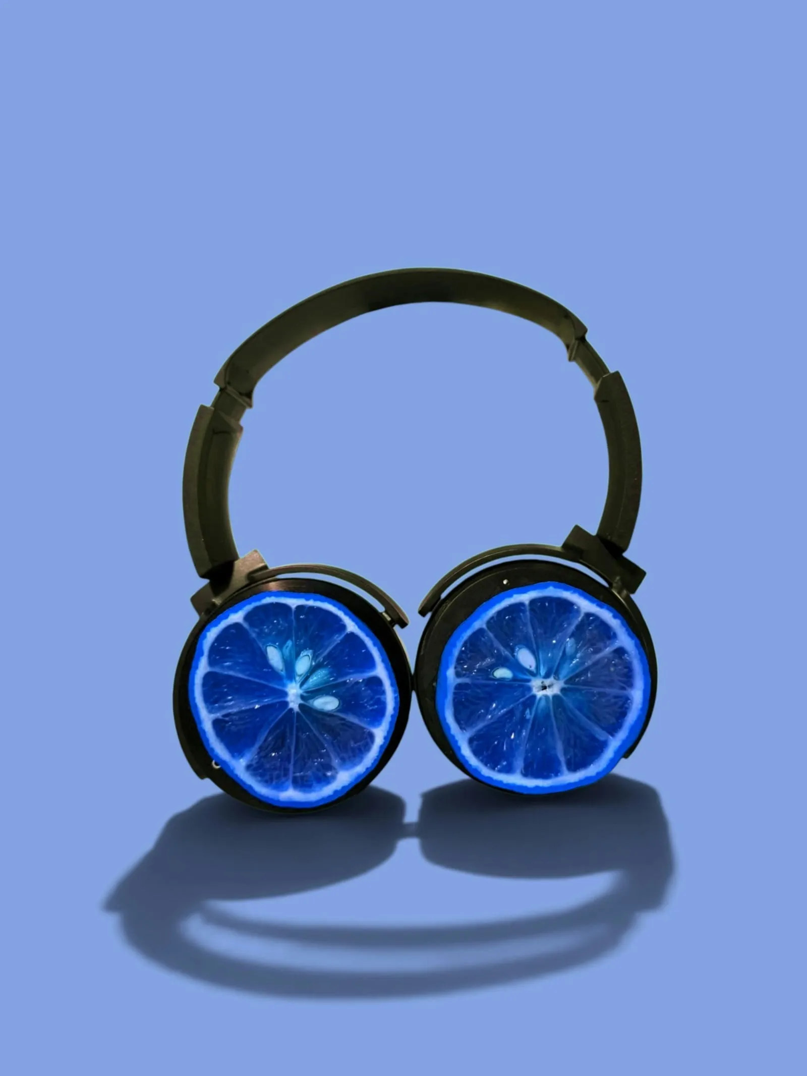
“Every other headphone brand looked like a bank. Lucenta made us look like the best party in town, and the sell-outs followed.”
The results
- Pre-orders before launch
- £1.4M
- Colourways in the first range
- 6
- Average customer review
- 4.9
Credits
- Creative direction
- Jonah Pierce
- Design
- Nadia Kerr
- Development
- Tomás Reyes
Next project
Halden
Roasted in daylight