Halden
Roasted in daylight
- Halden
- Coffee roaster
- 2026
- Lisbon
- Brand identity, Packaging
A new identity and packaging range for a Lisbon roaster that only roasts in the morning, built around the one thing their customers already loved.
The brief
Halden had outgrown a logo drawn by a friend and a bag that looked like every other specialty roaster on the shelf. They were about to open three cafés and start selling to supermarkets, and they needed a brand that could hold its own at both.
The idea
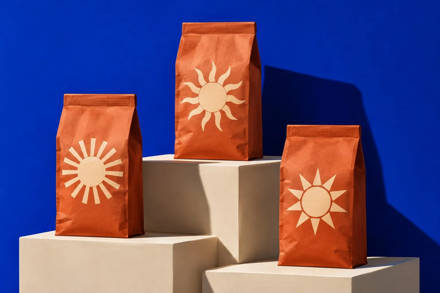
In the first workshop someone mentioned, almost in passing, that Halden only roasts before noon, “when the light is right”. Customers had been repeating it for years. We made it the whole story: a family of twelve suns, one for every coffee, each drawn to match how the roast tastes, from a soft morning glow to a hard midday blaze.
What we made
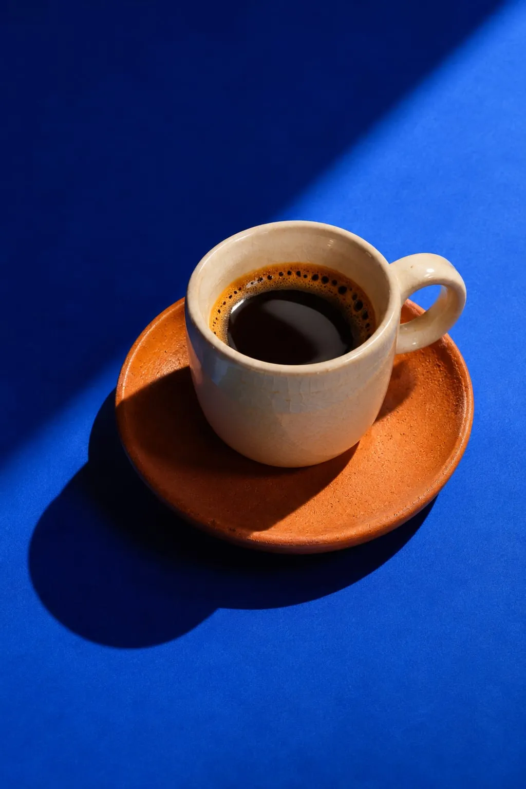
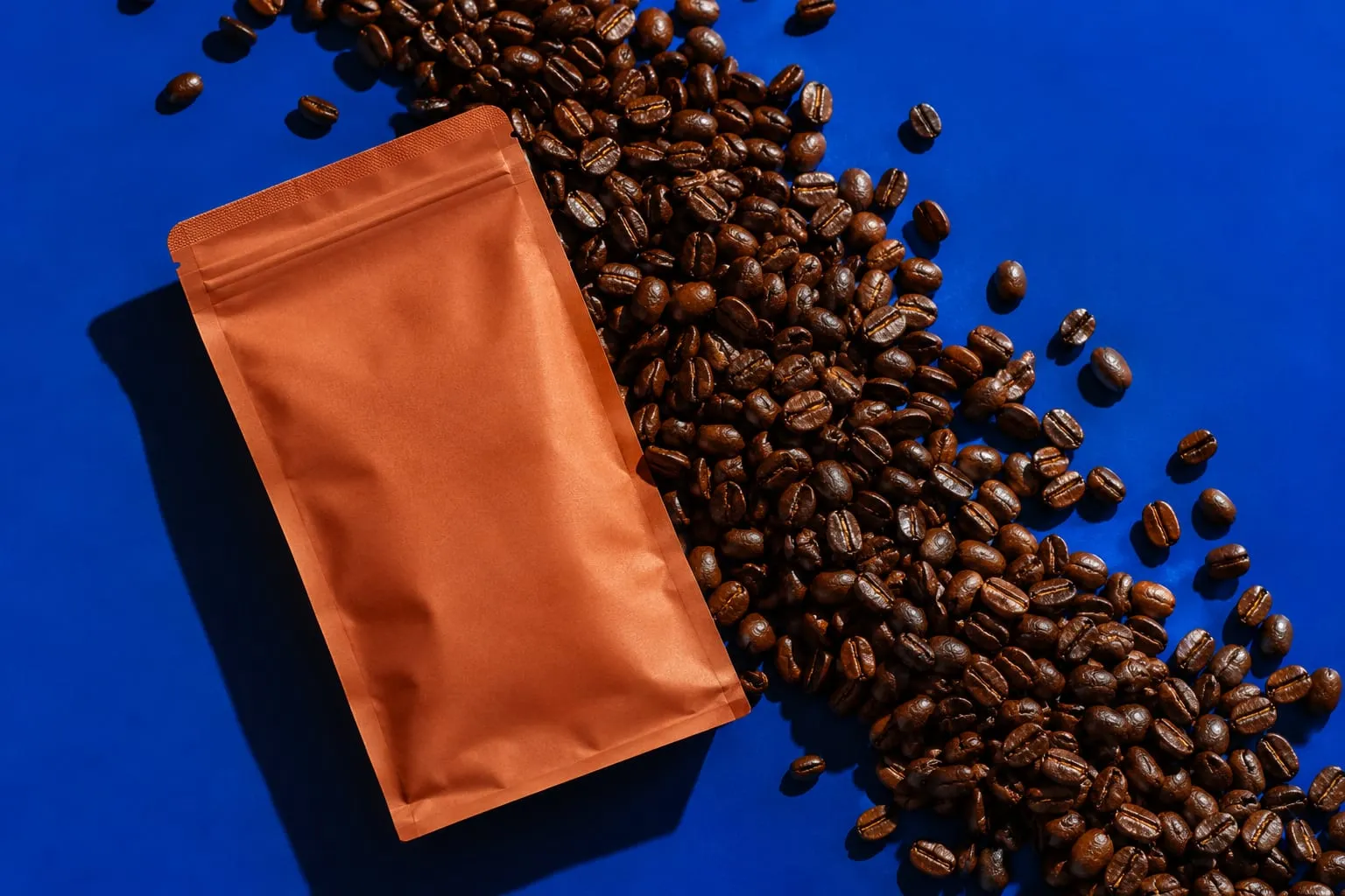
A cobalt and terracotta palette borrowed from Lisbon’s tiles, a warm grotesque for the wordmark, and a modular bag system that turns a shelf of twelve coffees into a sunrise. The same suns run through the café signage, the cups and the website, so you know where you are before you read a word.
“They found the one idea in our business we had stopped noticing, then made the whole brand about it.”
The results
- Wholesale accounts in six months
- 2×
- Coffees, one system
- 12
- New cafés opened
- 3
Credits
- Creative direction
- Mira Castell
- Strategy
- Jonah Pierce
- Design
- Lena Brandt
- Photography
- Lucenta Studio
Next project
Lumio
Light, sold in the dark