Juniper
Botanicals, served bright
- Juniper
- Botanical drinks
- 2024
- Oslo
- Packaging, Brand identity
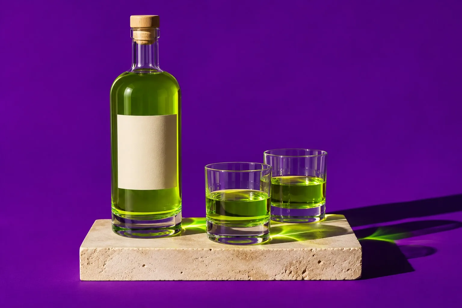
Identity and packaging for an alcohol-free botanical aperitif from Oslo, built around one luminous green and the way it catches the light in a glass.
The brief
Juniper’s founders distil an aperitif from juniper, sorrel and garden herbs foraged outside Oslo. It tastes like nothing else and, in a dark bottle with a long label, it looked like everything else on the back bar.
The idea
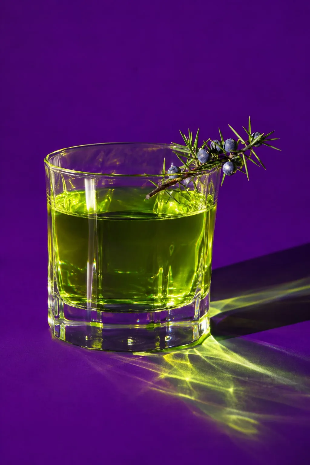
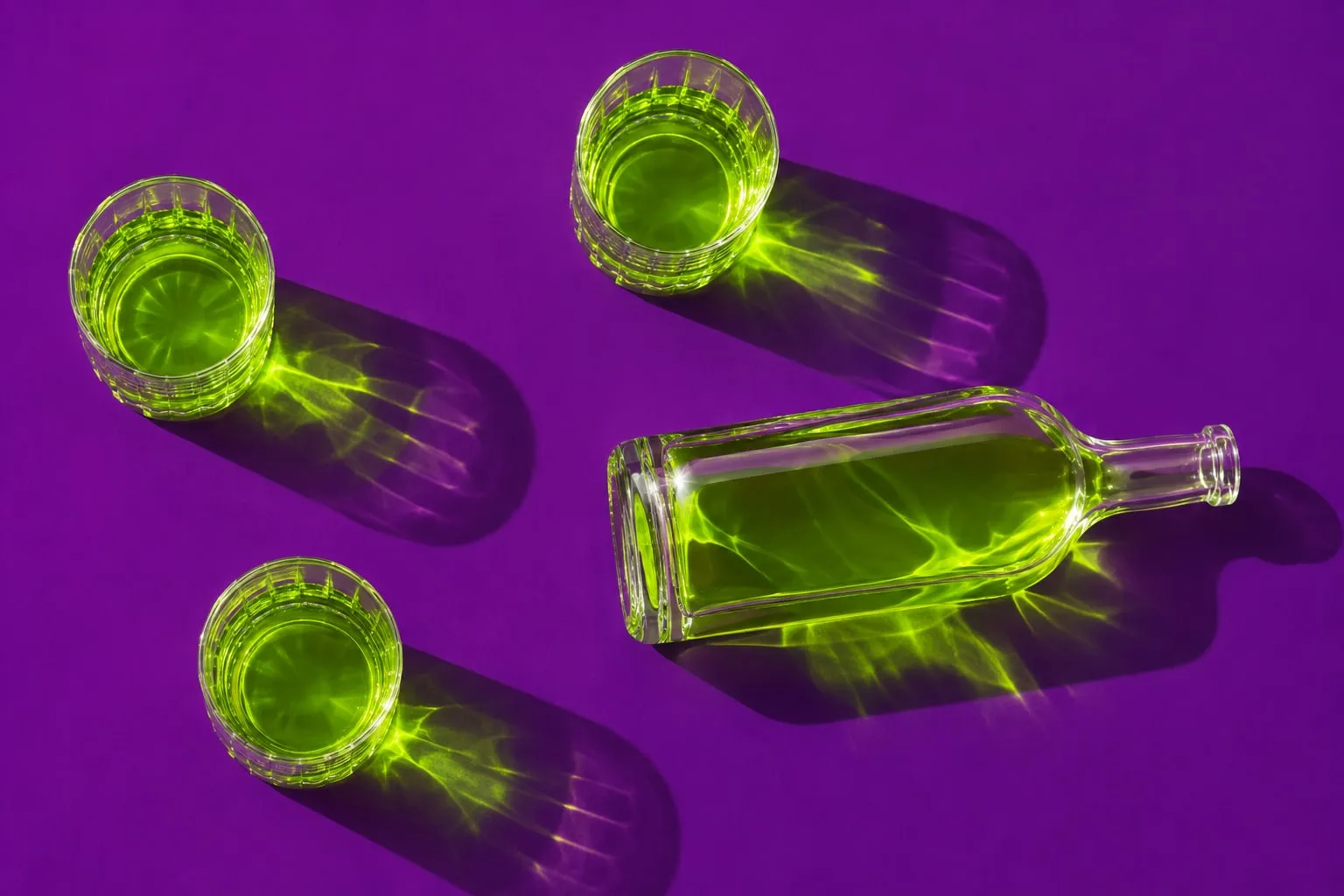
The drink is the colour. We made the green itself the brand: a clear bottle, a plain cream label, and every image shot in hard light against one deep violet, so the liquid glows and throws its colour across the table.
What we made
A clear, heavy-based bottle and a quiet serif wordmark, a shoot system built on light and shadow, outer cartons, a bar kit for restaurants, and the e-commerce imagery for the launch in eleven countries.
The results
- Pentawards, packaging
- Gold
- Countries stocking the range
- 11
- Recycled glass in every bottle
- 60%
Credits
- Creative direction
- Mira Castell
- Packaging design
- Lena Brandt
- 3D and motion
- Yuki Tanabe
Next project
Kitebird
Headphones with a sense of humour