Why we start every identity with a single colour
Before a logo, before a typeface, we pick one colour and defend it. Here is why that order works, and how we choose.
 Mira CastellFounder, Creative Director
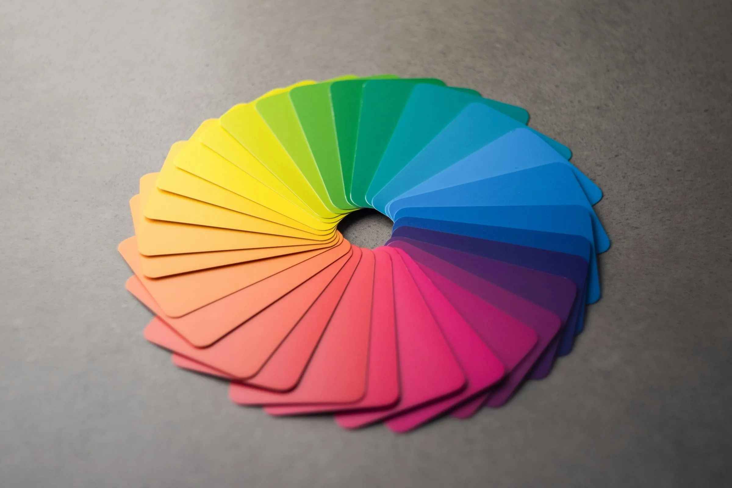
Most identity projects start with the logo, because the logo is what clients think they are buying. We start with a colour, because a colour is what people remember.
One colour, defended
On the first day of design we put a single colour on the wall, full height, and leave it there. Every sketch, every type test and every photo goes up beside it. If something fights the colour, it goes. If the colour starts to feel wrong, we change it early, while it is cheap.
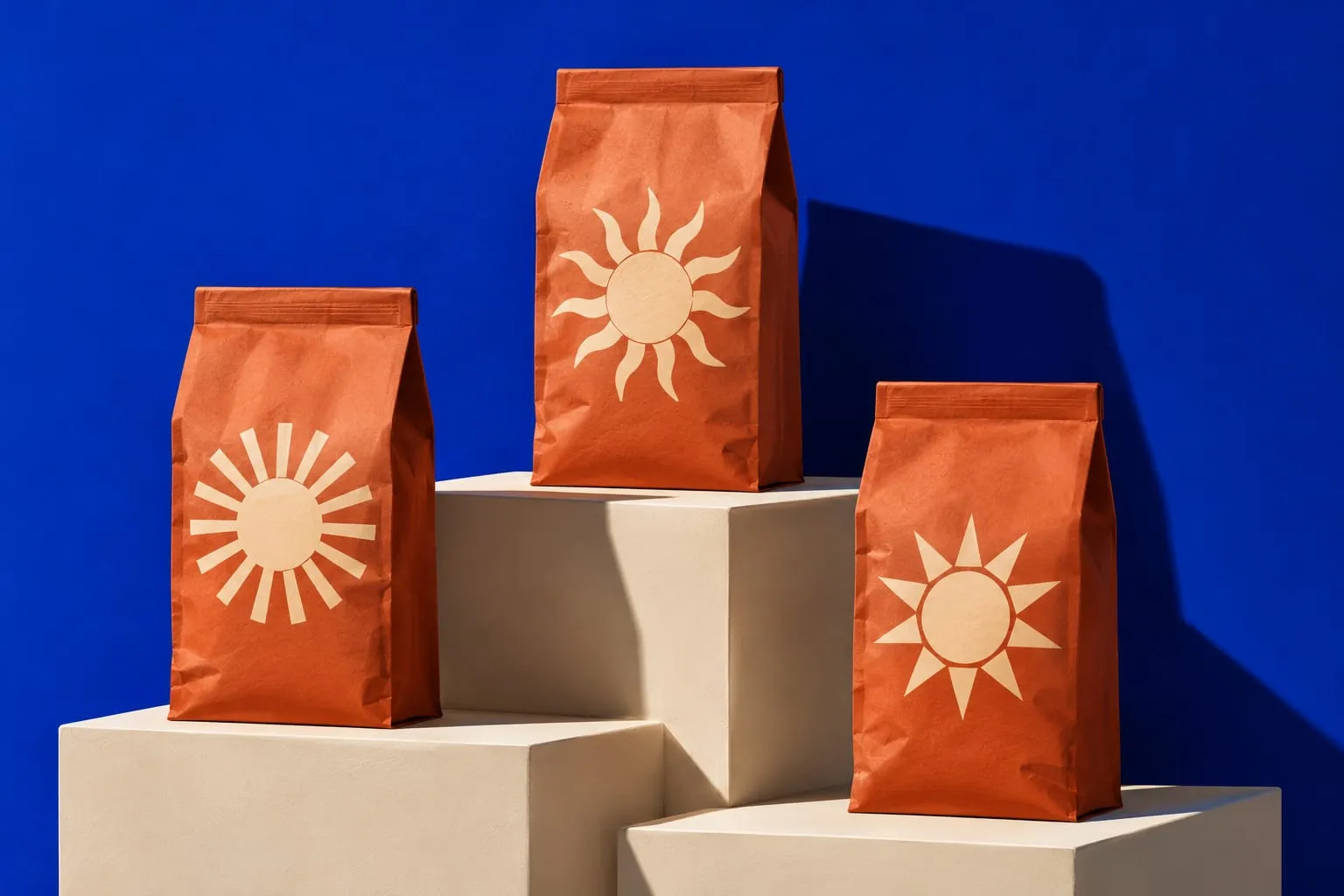
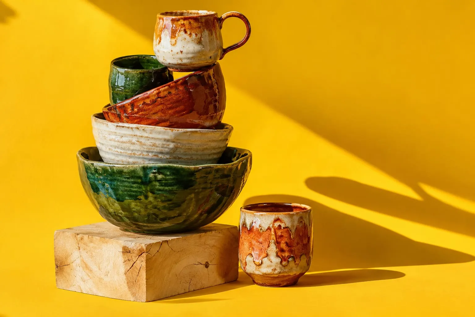
For Halden it was a Lisbon tile cobalt. For Kiln it was butter yellow. Both choices looked odd for about a week, and then they looked inevitable.
How we choose
We look for a colour that nobody else in the category owns, that survives being printed badly, and that the founders can describe without a swatch. “The blue of the tiles at the station” beats “Pantone 2728” every time.
A colour you can describe is a colour people will repeat.
What it changes
Starting with colour forces decisions in the right order. The type has to stand up to it. The photography has to be lit for it. The logo can be quieter, because the brand is already recognisable from across the street.