Ostra
A seafood bar in full colour
- Ostra
- Restaurant
- 2025
- Porto
- Brand identity, Spatial
Name, identity and interiors for a twenty-seat oyster bar in Porto that wanted to feel like a party, not a fish market.
The brief
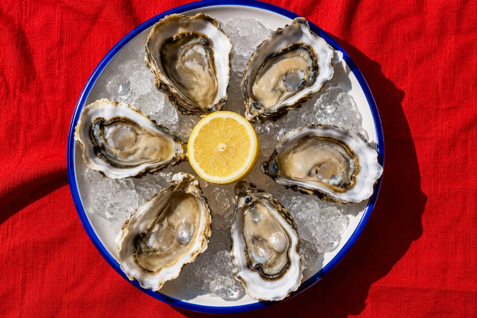
Two chefs with a tiny room on a side street, a great supplier and no name. They wanted seafood without the nautical clichés: no rope, no navy, no anchors.
The idea
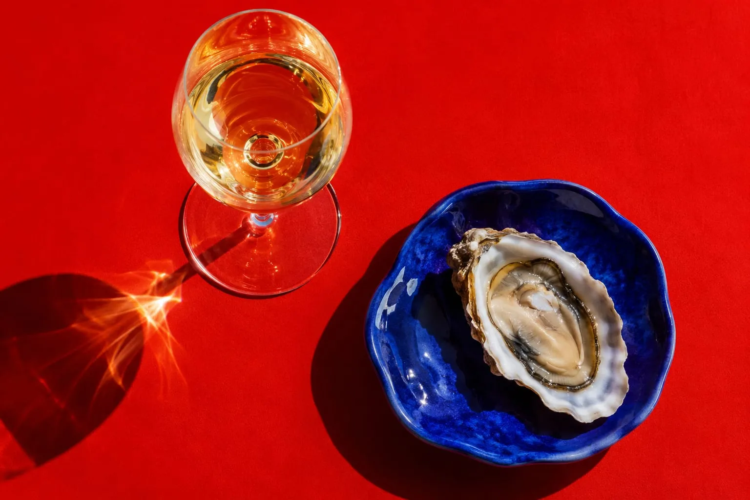
Seafood bars are cold and blue. We went hot. Tomato red lacquer from floor to ceiling, cobalt only underfoot like the sea, and a single marble counter running the length of the room so every guest sits at the bar.
What we made
The name, a heavy italic wordmark that looks like it is leaning in to talk to you, menus printed on red stock, uniforms, tableware and all signage, designed alongside the architects from the first plan.
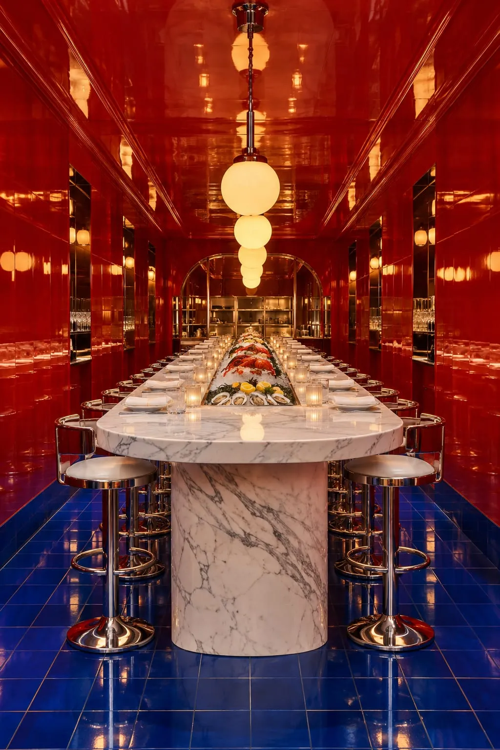
“People photograph the room before they order. That has never happened to us before.”
The results
- Waiting list after opening night
- 6 wk
- Seats, full every evening
- 20
Credits
- Creative direction
- Mira Castell
- Interiors
- Studio Alvo (architects)
- Design
- Lena Brandt
Next project
Kiln
A shop that feels hand-thrown